2023
Designer:
Max Etheridge
Warehouse 660
Rebrand


Process
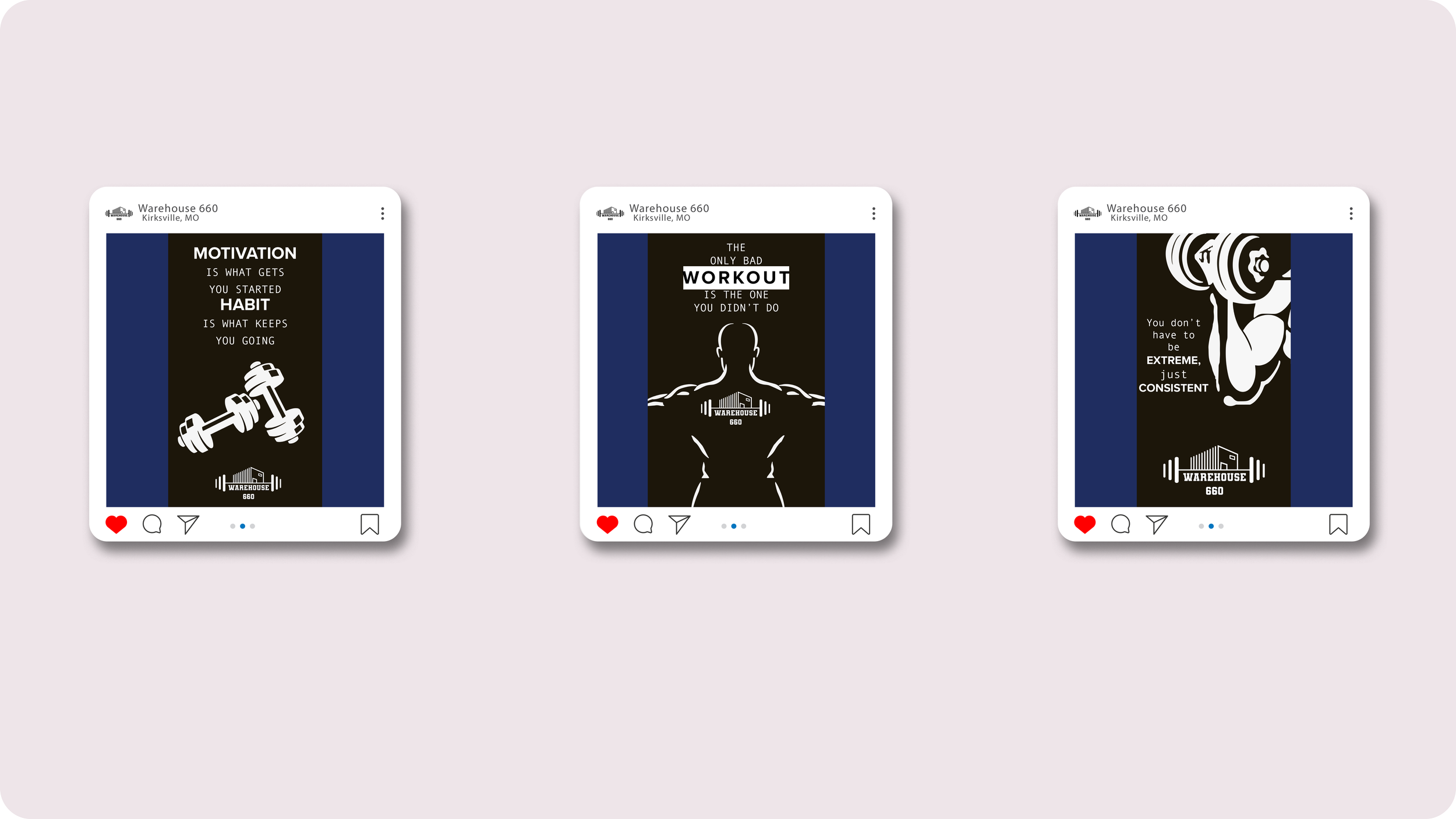
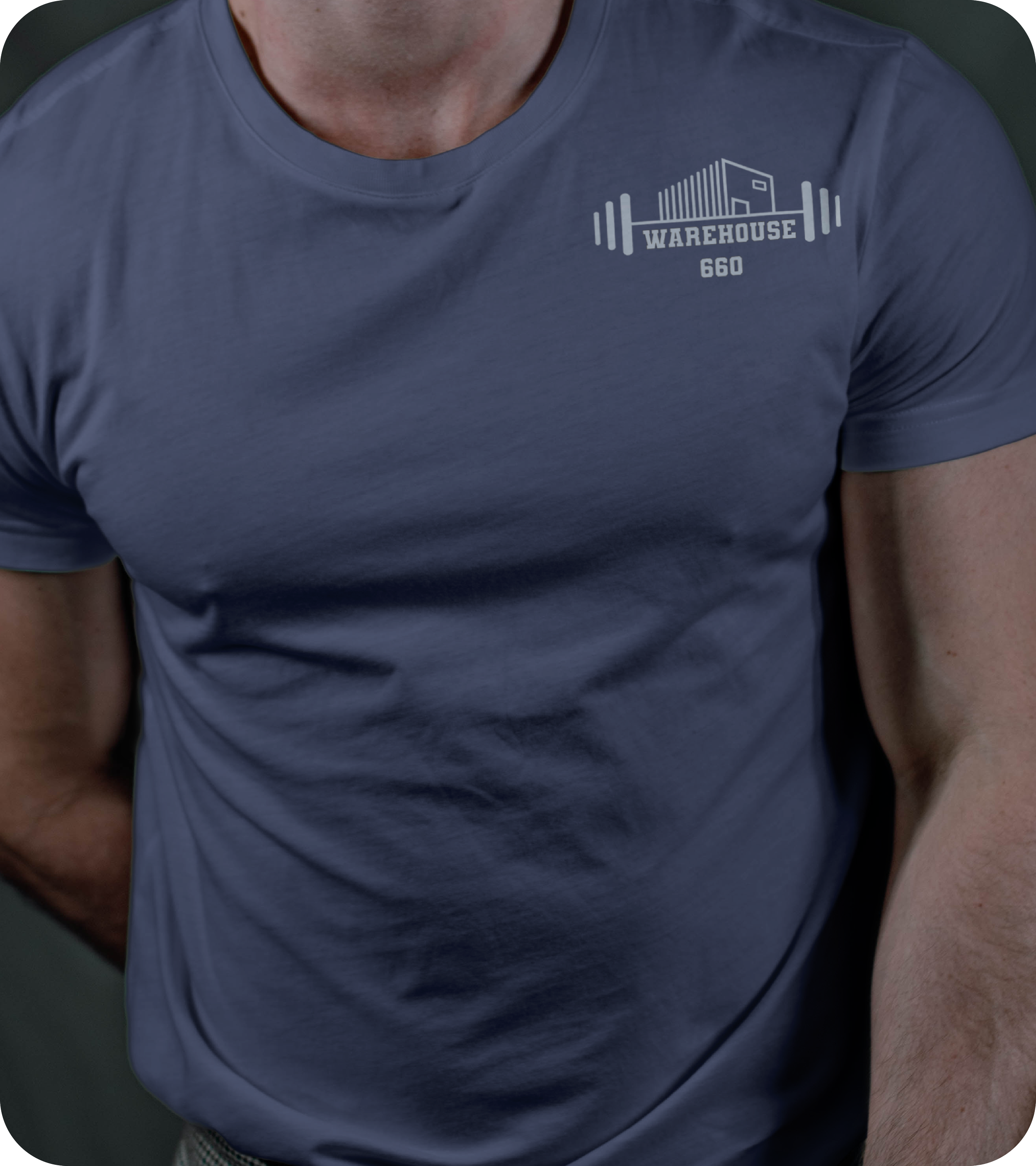
Warehouse 660 is the largest commercial gym in Kirksville, MO. It’s also an actual warehouse building as the name would suggest. For the logo I wanted to combine the warehouse with the gym. This materialized with the idea of placing a simple warehouse on barbell. Not only did this symbolize the two ideas but also conveys a sense of strength. The athletic feel of the varsity team font made sense for the main typeface.


Typography
The main typeface for Warehouse 660 is Varsity Team, it’s athletic feel and common association with sports and fitness made it the perfect fit. Impact is utilized as a subheading and informational font, due to it’s bold and legible appearance. Helvetica is used for body text and smaller informational sections on brochures and stationary keeping them professional while still retaining some boldness.
Colors
The Warehouse 660 color palette is a combination of muted colors for stationary and social media backgrounds. These muted colors work well in tandem for the two hues of blue which are meant to be utilized as highlights for posts and headings. The blues are also meant to be utilized within the gym as they convey a sense of confidence, perfect for a lifting environment like Warehouse 660